Living Beauty
Living Beauty is an innovative leader in the beauty and skincare space, offering the holy grail of highly-effective and uniquely-relevant products and professional beauty services.
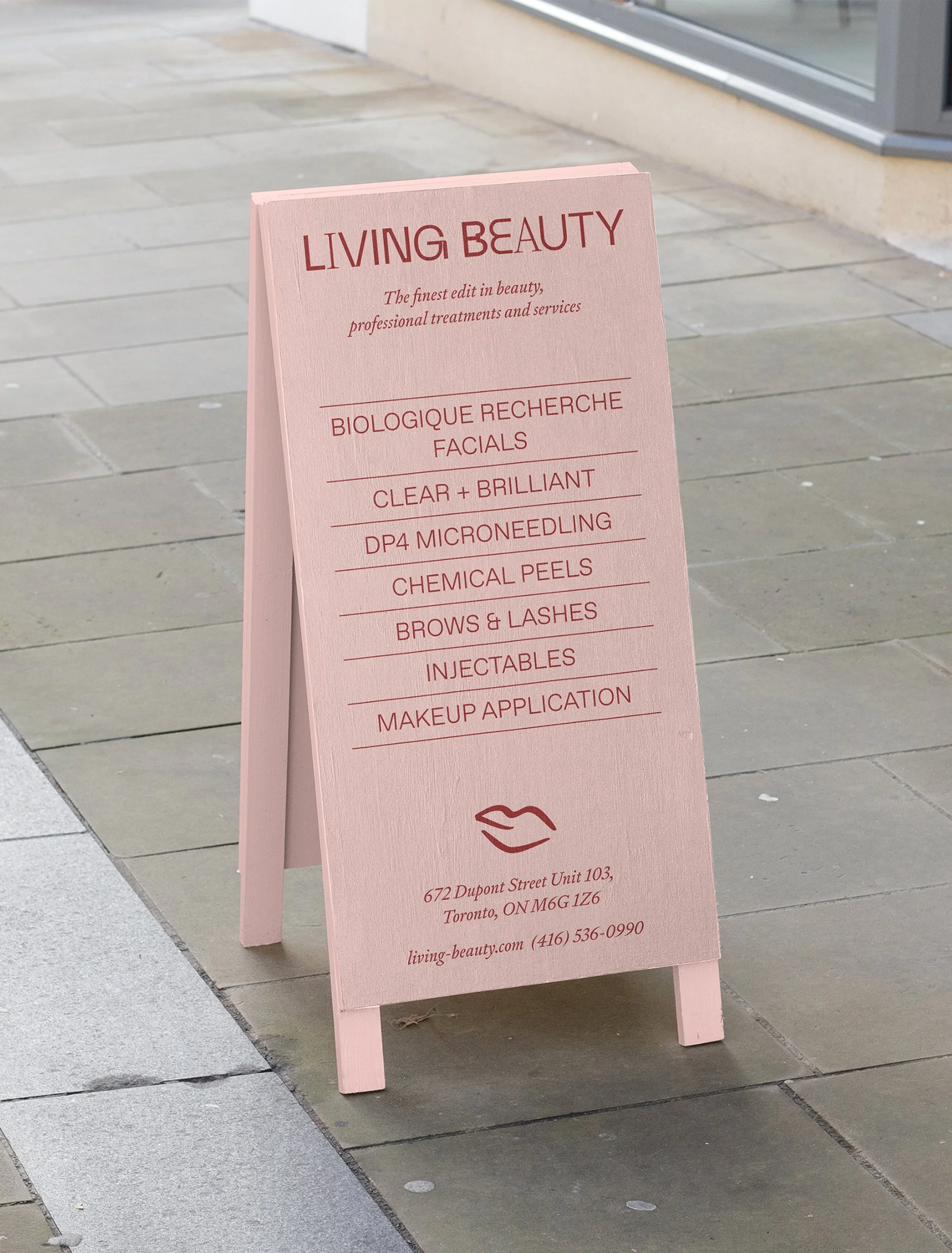
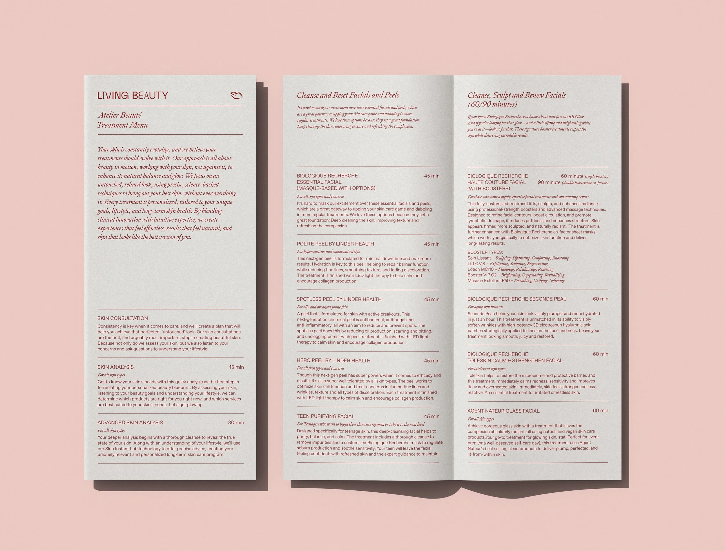
Over the course of 3 years, I worked with the Public Office team on various Living Beauty projects, including a refreshed visual identity to support their expansion from a wholesale-only company to a D2C brand, a series of 7 quarterly broadsheet publications, an extensive collection of photography, and signage and wayfinding for their first flagship retail store.
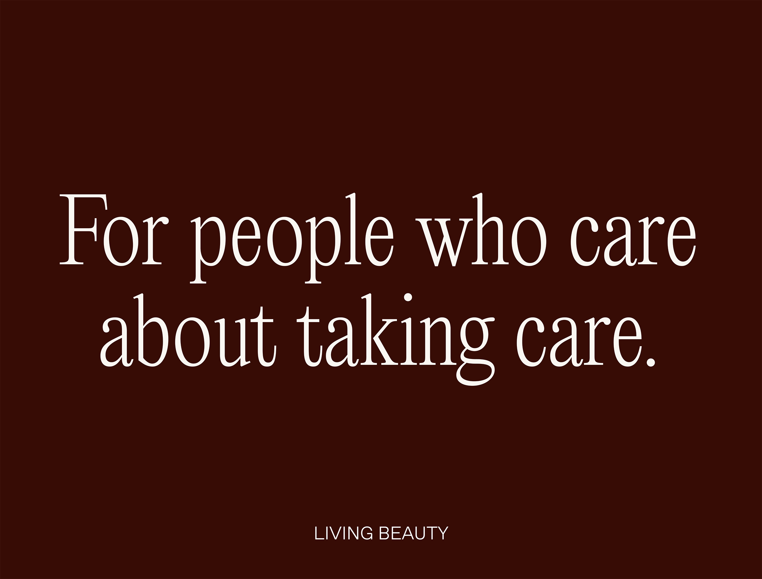


The brand’s new colour palette was inspired by some of the Living Beauty founder’s favourite iconic beauty products. The palette as a whole is meant to fit within the beauty space, with a hint of unexpected boldness.
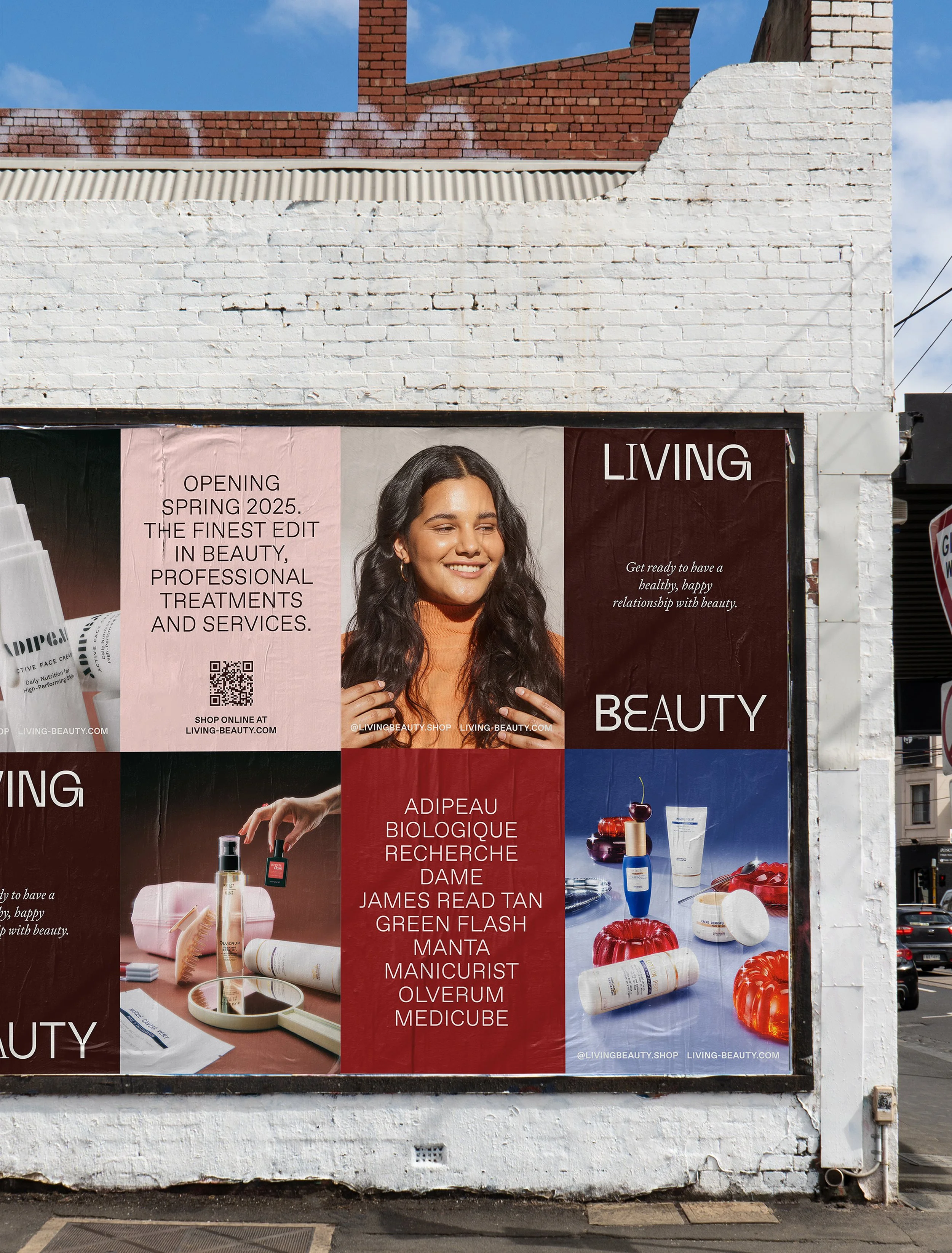
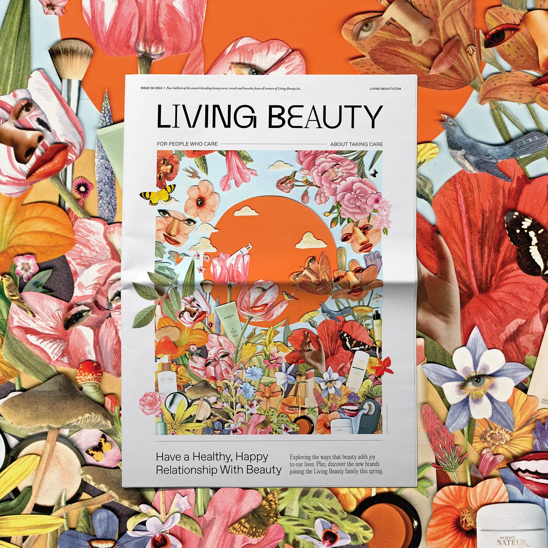
Living Beauty’s bold and design-forward look & feel expresses itself through art direction and photography. Our playful and experimental approach to photography style has resulted in a broad collection of imagery that feels dynamic, unexpected and bold for its category.

Storefront windows of the flagship location were papered during construction, featuring an illustrative representation of the interior architecture.


Living Beauty’s quarterly broadsheet discusses innovation in the beauty space with interviews, new products and brands, educational pieces and lifestyle-focused pieces. Each issue is based on a theme, which influences the art direction, allowing us to lean into trends and seasonality.
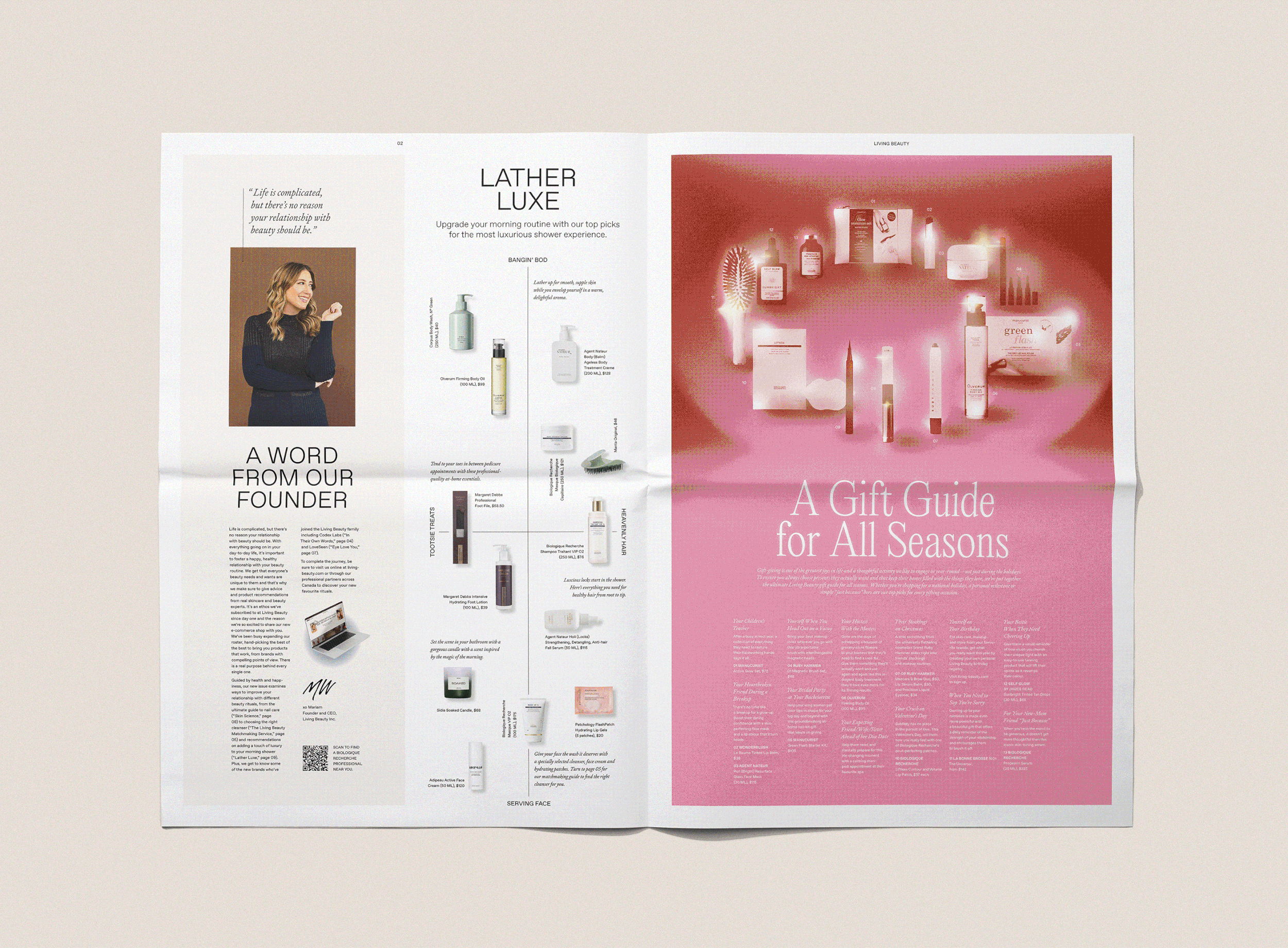


Content produced for the broadsheet is adapted for use across different channels, like web and social media.

